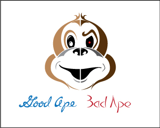
good ape/bad ape-v2
by Coy • Uploaded: Jul. 21 '09

Float
(Floaters:
3 )
Description:
a few small changes to the image.
Status:
Just for fun
Viewed:
1494
Share:


Lets Discuss
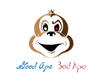
Cool illustration Coy...reminds me of batmans %22two-face%22. The eye of the good ape seems to have too much going on or something. I think the glare that you have on the black area is sufficient, I'd get rid of the black glare that's inside of what is the pupil area...The mean side does sort of have a terminater look to it as someone else mentioned, as well as a Grinch like feel. You just need to think of what industry this could be applied to. Try bumping the faces together so that there isn't white line going down the middle to seperate...and see how that looks. Hope this helps :)
ReplyThanks Jennyb%0D*I've made some changes. Made the red pupil larger in hopes of making it less Terminater-esc. droped the black glare. As far as industry I was thinking of something/someone that would report or have a review about things giving or discussing the good and bad point of views maybe? blogger, consumer reporting? Not sure though. I was doodling around and came up with it. %0D*link to the changes - http://logopond.com/gallery/detail/72623
ReplyPlease login/signup to make a comment, registration is easy