The Kids Cancer Project
by CoreSydney • Uploaded: Oct. 16 '12

Float
(Floaters:
0 )
Description:
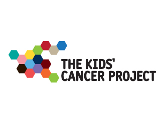
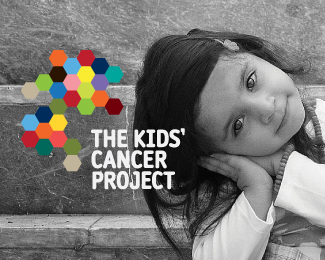
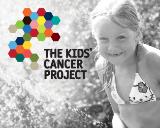
As part of a wider brand strategy project, Core renamed and then created this new visual identity for The Kid’s Cancer Project.
Formerly the Oncology Children’s Foundation (OCF), the charity needed a new name that was more easily understood and better described their goal to find a cure for kids’ cancer.
The molecular design concept represents the science that will provide the cure and also the way the charity brings together the best researchers around the world to combine their expertise.
The new identity is currently being rolled out across all the charity’s materials and activities.
Solution Process
The design process started by interviewing many of the charity’s stakeholder groups including key staff, medical researchers, volunteers and consumers. Plus, with a great deal of sensitivity, kids’ cancer survivors and parents who had lost their children to the disease.
It became clear that the charity had significant ‘DNA’ that we wanted to capture in its new identity. These factors included the unique way they bring together the best minds from around the world to collaborate – ‘networked knowledge’, and also the desire for an optimistic tone that was brought in to the colour palette and typography.
As seen on:
The Kids Cancer Project
Status:
Client work
Viewed:
2096
Tags:
Kids
•
Charity
Share:
Lets Discuss
Please login/signup to make a comment, registration is easy