Officina 405
by ConcreateStudio • Uploaded: Jul. 26 '13

Float
(Floaters:
0 )
Description:
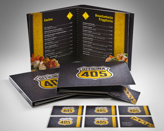
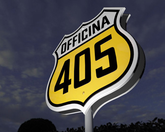
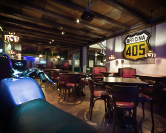
Pub.
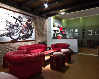
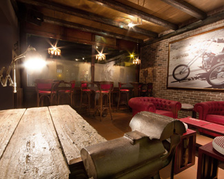
Officina 405 is a pub inspired by the counterculture of the 1960s' in the USA and its values like freedom and itch for break out.
For this project we took inspiration from the Route 66, that asphalt myth which smells of adventure and gives life to the pub's image.
The symbol has a characeristic form of the road signs in the USA which recalls the famous Route 66, a simbol of liberty and the 'on the road' lifestyle.
The font has been designed with paying a particular attention to a legibility and, in a the same time, it results compacted, forceful, pushful.
The colors have been chosen to add a further significance to the logo - its form combined with a yellow (a beer) and a white color (a froth) create a beer pint.
As seen on:
Concreate Studio
Status:
Client work
Viewed:
2049
Tags:
Typography
•
Type design
•
Hidden message
•
Road sign
Share:


Lets Discuss
Please login/signup to make a comment, registration is easy