Float
(Floaters:
37 )
Description:
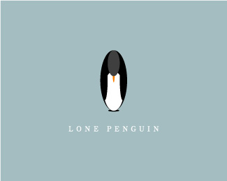
Concept design for Lone Penguin Design Studio. Feedback? Thanks...
Status:
Nothing set
Viewed:
14562
Share:


Lets Discuss
I like how the mark is contained within the oval. The penguin does give the impression of being downcast though.
Replyit kind of looks like your looking at someone through an oval from behind.
ReplyAppreciate the comments... I was definitely trying to capture the feeling a penguin might feel if it was alone...
Replymaybe if the penguin's feet were pointed straight ahead, he wouldn't look like an oval resting in the snow. You've captured his desolation and loneliness perfectly!! Good work mate!
Replyi love this
Replygreat job on the penguin, you really capture the feelings!
ReplyI like it for the most part but why no face? Without seeing the eye of a person or animal there can be no rapport.
ReplyThanks to all for the comments! Topfuel- generally, it's kinda hard to see a penguins eyes when they're grown, and in my design, the penguin is looking down... so i just decided to leave out the face elements. I completely understand what you're saying tho... thanks for the feedback!
Replywhen is he going to flip over :p great use of colors
Replylove oval form, great %3B )
ReplyI like the oval.. and it would great without the type and in black and white.. but I think the little guy might need feet.. my eye doesn't know where to go except stare at the oval.. KUDOS!
ReplyThis penguin is sad as hell, man! Good work!
Replylonesome yet awesome
ReplySad but so great. Terrifik !
Replygreat job
Replyaww! I felt bad for the little guy, but I'm pretty sure that means you did a great job of making him feel lonely. The color works nicely as well.
ReplyPlease login/signup to make a comment, registration is easy