CGFP
by ClaireHayes • Uploaded: Jun. 30 '14

Float
(Floaters:
0 )
Description:
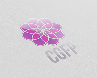
Breadbox Marketing, who had worked directly with Corinne Gepp to define her goals and marketing strategy, came to us with a brief to create a logo that was feminine and didn't feel like a typical or boring financial company.
With the industry heavily associated with men, CGFP wanted to use her femininity as a selling point. The floral inspired logo icon represents how financial planning can grow and flourish wealth, whilst the symmetrical and precise line-work define the structure and careful planning that goes into it.
As seen on:
CGFP
Status:
Client work
Viewed:
1955
Tags:
precise
•
plan
•
planning
•
wealth
Share:


Lets Discuss
Please login/signup to make a comment, registration is easy