Description:
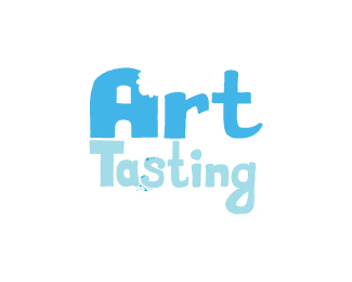
Project for a local nonprofit that helps bring art to the community in bite size portions.
Status:
Work in progress
Viewed:
1328
Share:

Lets Discuss
More color! Any maybe some crumbs.
ReplyI'll take crumbs please. %3B-)
Replyand did the mouth taking the bite have one large tooth in the front of his/her mouth?
ReplyCrumbs! That would be a great complement to the bite mark. I will also look at making the logo two colors which should help pop out the crumbs.**And to the mouth bite itself, I was hoping the one large bite in front would come across as the two front teeth as one unit. Back to the bite board.**Thanks for the advice!
Replyit feels very fun. I can see this animated,
ReplyI have added some crumbs and changed the color a tad. Not satisfied yet so I will keep chipping away at it.
ReplyPlease login/signup to make a comment, registration is easy