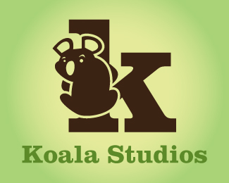
Koala Studios
by CharismaDesign • Uploaded: Apr. 28 '09

Description:
[Here is an updated version of the logo with thought given to the first comment made below.]
This is my attempt at recreating the logo for this company. They want to revamp their over-all look to become more upscale and sophisticated.
Any input you guys can give me on this logo would be great. Thanks!
Status:
Nothing set
Viewed:
1659
Share:
Lets Discuss
this does not say sophisticated and upscale at all with the awkward and pissed off looking Koala clinging to the k. I think the lower case k is the way to go, however. but try to think of other angles to design from besides the obvious.
ReplyPlease login/signup to make a comment, registration is easy