Royco Closets
by Chanpion • Uploaded: Sep. 23 '07 - Gallerized: Sep. '07

Float
(Floaters:
28 )
Description:
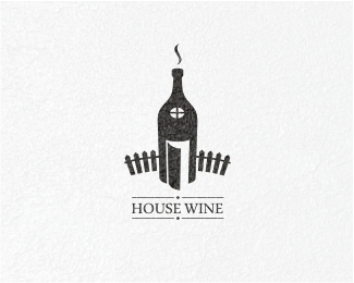
Proposed logo for closet making business. The mark consists of the negative 'R' and the positive 'C'. The mark as a whole also represents drawers in a closet.
Status:
Nothing set
Viewed:
10470
Share:

Lets Discuss
howdy Chan...*I dig it but I'm seeing an 'A' instead of R...if you where to put little indents (or angle the stem inwards) either side of the middle bar it would give a stronger impression...(I hope this makes sense)? Kinda have the same dilemma with my own mark...but as a concept it rocks...
ReplyHey Paul, hows it goin mate! Thx for the input bud. Actually the 'R' is the negative space. Do you see it? Cheers pal.
ReplyNice one chanpion!
ReplyI feel blond...seeing it now Chan...anyways 'tis a great concept...the negatives and positives they always get me!
ReplyThis is very nice Chan.
Replyvery nice bud...
ReplyRoyco, I like the sound of that. %3B)
Replylol !!! So nice..., very nice...
Replynice one friend..%0D*i like it.%0D*
ReplyVery nice mark :)
Replywhere's raja? :D**clever mark, chanpion.
ReplyThx everyone! @gcm: yeah, when I finished this logo, it did reminded me abit of raja's personal mark. Its a good thing he's not branching out to closet making anytime soon, i hope. Cheers.
ReplyReally a great icon, chanpion
Replynice one!**yeah, that's kind of an eerie coincidence that it's similar to the %22r%22 in raja's mark. I would have never in a million years realized it, had both marks not been on the same page of logopond.
ReplyChan the man!! Nice one, bud.
ReplyVery nice! Very good work.
Replynice one chan - you are right, I will stay far away from closets. I think I would lower the 'clostets' type down a bit more to give it equal spacing above as in the spacing below the mark and main type
ReplyHow does one get in contact with you? I have clients who want YOU! Please connect with me...**As for this logo, Simply Beautiful!
ReplyChanp, hey I do like this but cannot get over the fact it looks like something else I've seen, HUMM.. what was that? %0D*Great minds think a like. You know it's only off by one line :-) And it just happened to be on the FP at the SAME time. LOL! good work anyhow.%0D*Cheers mate!
ReplyLOL.. i think its cause the two are on the front page.. %26 the similarities in color.. otherwise... its only almost the same lol.. kiddin
ReplyDamn! why did the client choose that colour! If raja ever decides to pick up a hammer and chisel, i'm done for.%0D*%0D*Anyway, thx muchly guys.
ReplyPlease login/signup to make a comment, registration is easy