Description:
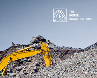
A creative integration of Horse and a bulldozer!! Drop your feedback.
Status:
Client work Viewed:
14570
Tags:
branding
•
logo
•
bransense
•
white Share:
Such a great concept! I wonder if you could simplify it a bit. Try the bulldozer in solid black without the holding shape, and let the horse be negative space. Awesome idea.
Thanks for the comments mates. And about the comments, we made the bulldozer thingy a bit detailed and same outline style because we want people should stuck in the view of bulldozer for a while. :) They only want to see the horse after reading the text. :) This will work a bit differently. Thanks again all :)
Yes I saw the graphic as a double horse head, and only later did I see the backhoe. I think the changes I suggested would have exactly the effect you describe, making the backhoe more visible first and then horse appears in the negative space only after a closer look.
That's what makes this logo so great! I saw a Horse first,then saw the Bull Dozer. Winner winner chicken dinner. Still would like to see the above mentioned comments tried.
Thank you all for your comments and support. I've tried all versions like you suggested. But i didn't feel this perfect from any of that variations. Felt like something is missing in those. So I think this should go better like this. Once again, i really appreciate all those who had criticized and suggested the changes.
Feel free to check our website for more works: www.bransense.com


Lets Discuss
Now that is one cracking concept!
Replyit took me a second to see. Awesome!
ReplyClever!
ReplySuch a great concept! I wonder if you could simplify it a bit. Try the bulldozer in solid black without the holding shape, and let the horse be negative space. Awesome idea.
Replyi ike it very much! Clever! But im agree with lumavine.
Reply^^ I third that idea. Great one.
ReplyGreat concept. The name sounds a lil odd to me. Maybe the stallion construction...but i c that it is client work...:) just a thought.
ReplyGreat idea! Agree with the above!
ReplyMasterpiece!
ReplyAwesome, great concept mate!
ReplyThis is so great!
Replywow. so clever!
ReplyIt's a really smart and perfect work! Genius! Well done!
ReplyThanks for the comments mates. And about the comments, we made the bulldozer thingy a bit detailed and same outline style because we want people should stuck in the view of bulldozer for a while. :) They only want to see the horse after reading the text. :) This will work a bit differently. Thanks again all :)
ReplyI actually saw the horse first. It's a great concept but I also wonder about the shapes in block colour as opposed to lines...
ReplyYes I saw the graphic as a double horse head, and only later did I see the backhoe. I think the changes I suggested would have exactly the effect you describe, making the backhoe more visible first and then horse appears in the negative space only after a closer look.
ReplyGreat design! Only a matter of time till it finds its way into logo collection books
ReplyI hope you keep it as is. If the logo ever needs to be teeny, you can then make the backhoe solid black as an alternate.
ReplySaw the horse first, but not the bull dozer until you mentioned it. Great work.
Replysaw the bulldozer first, but not the horse until you mentioned it. Great work.
ReplyThat's what makes this logo so great! I saw a Horse first,then saw the Bull Dozer. Winner winner chicken dinner. Still would like to see the above mentioned comments tried.
ReplyJust think it needs to be more SOLID!
Reply^ Yeah line weight might be bit 'delicate' for the construction industry.
ReplyBrilliant..
Replyyeah, would be great to see a solid bulldozer/ negative space horse! brilliant concept!
ReplyI agree, brilliant!
ReplyWow, brilliant!
ReplyThank you all for your comments and support. I've tried all versions like you suggested. But i didn't feel this perfect from any of that variations. Felt like something is missing in those. So I think this should go better like this. Once again, i really appreciate all those who had criticized and suggested the changes.
ReplyFeel free to check our website for more works: www.bransense.com
Wow!!!
ReplyThe way you managed to mix these two elements is awesome.
sweet!
ReplyPlease login/signup to make a comment, registration is easy