Description:
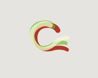
Italian online store specialized in selling regional genuine Italian products.Concept_The perfect spaghetti in the shape of the “C”, as my Italian friends would say “al dente”. Thanks to gravitart for creating this insane font. Alen, cheers for your offline advice bro...two pieces works better:)
Status:
Nothing set
Viewed:
1943
Share:


Lets Discuss
very pretty, and soft. think the type works well with it. *may i ask why you dropped one color in the mark? as previously you have one with 3 colors. Just wondering how that version doesn't work out.
Replylol...he's everywhere.**@ kathariney*Thanks:) The client has yet to see them, but I like to give them options.
Replyah, i see. thanks for explaining :)
ReplyLovely mark, Fabian. Really feels like spaghetti. :D I do like it better with the red added, though.
ReplyPlease login/signup to make a comment, registration is easy