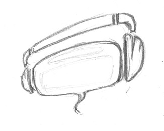
Description:
rough version. this is reject logo for a call centre
As seen on:
www.agentorange.co.za
Status:
Nothing set
Viewed:
1256
Share:




Lets Discuss
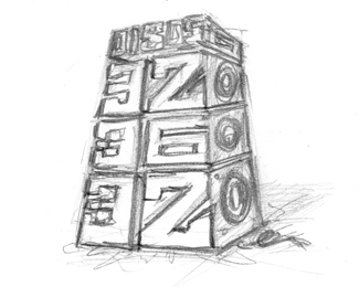
I think many rough versions of one logo are not interesting for people
ReplyI think maybe you are right. This is LOGOpond. Not THUMBNAILpond.**I know I'm picking on you today but come on! You've got an over active upload trigger finger.
ReplyPlease login/signup to make a comment, registration is easy