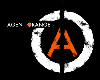
Description:
I was going for a tpypographic deconstructive look, not sure if it is too much in terms of our corporate clients, would they aspire to be assocyed with this brand? ideas! suggestions!
As seen on:
www.agentorange.co.za
Status:
Nothing set
Viewed:
3776
Share:

Lets Discuss
I think the corroded look goes well with the name (toxic, cancer-causing...) %26 I like the placement of the words.
ReplyThis looks similar to the anarchy symbol worn by punk rockers.
Replythanks guys for the comments it is incredible how the american market do not like the name, hate it infact because of the histiry and the side effects.... The name as a stand alone is powerful and cool.**
ReplyPlease login/signup to make a comment, registration is easy