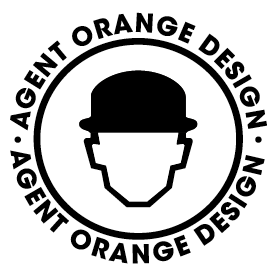
agent orange design
by BrandonBarnard • Uploaded: Nov. 29 '10

Float
(Floaters:
0 )
Description:
Still on a mission to crack our company logo for Agent orange design based in johannesburg in south africa. Now i have picked up alot of slack about the name, so to all those who have an issue chill lax peps
As seen on:
wwww.agentorange.co.za
Status:
Unused proposal
Viewed:
2804
Share:

Lets Discuss
now that i look at this logo, it reminds me of my design hero Anton Corbijn work he did for depeche mode, songs of faith and devotion - which by the way is the greatest band.
Replymark is good, type does not lend itself to it though, and your wrong about depeche mode been the greatest band, that particular honor belongs to talk talk!
Replymmmmm talk talk is a great band but depeche mode are legends!
Replywhat type would you suggest mcdseven?
Replythe type you have is fine, I think the issues I have is that both elements are nice, I think the Agent orange logotype pound for pound is better than the Logo mark, but I like the looseness of the Logomark execution with a name like agent orange it kind doesn't take itself to serious. But together they don%3Bt work. I would just have an ordinary sans serif without alteration, thats just my opinion, if I was called agent orange I would be more than happy to put that very nice A in an orange roundel, to me that would be perfect but thats just reflecting what I like. Its hard coming up with ones own id, its damn hard.
ReplyPlease login/signup to make a comment, registration is easy