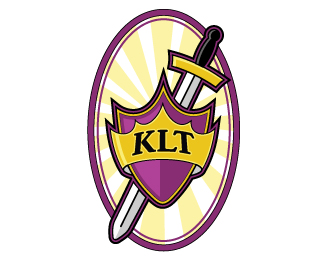
Kingdom Life Tabernacle
by Brainchild • Uploaded: Jan. 05 '10
Description:
Kingdom Life Tabernacle requested a more contemporary, bold identity than their previous logo which utilized generic clip art and stretched graphics from improper scaling. They wanted the specific colors of black, gold and purple and the shield, sword and crown for symbolic meaning. We designed a logo with bold colors, thick outlines with illustrative highlights to maintain a contemporary feel to appeal to a younger audience while keeping the design itself clean and subdued to be respectful of what it represented.
As seen on:
http://www.brainchildcollective.com/what_do.html
Status:
Client work
Viewed:
1521
Share:



Lets Discuss
Please login/signup to make a comment, registration is easy