Description:
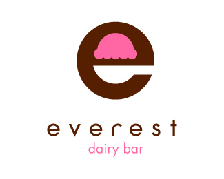
Logo proposal for a Dairy bar. The negative space form a spoon and the ice cream.
Status:
Unused proposal
Viewed:
7014
Share:
Lets Discuss
@nido*I know that the idea was made before, but it was not intentional, it's not the same market, it's a small shop and for me the final result is not the same.**What do you guys think about that? My client have already see it and he's in love with the logo.
Replybraaaainnns ! ...just kidding. this is the best one.
ReplyAbsolutely this one. Great job.
Replywhy is it for sale?
Reply%5E Strange. Also, why are you doggedly sticking to this design when both nido and I have pointed out the same egg and spoon logo? You've just rounded off the edges. No amount of rounding off will change the idea.
Reply@ bouchardoli - I think your logo kicks the crap out of the egg and spoon logo as far as execution - yours is done very well. If the company you did it for is only a small, local, privately-owned store selling ice-cream in town and they only plan to advertise locally then you should be fine with this logo. However, if they intend to branch out regionally or nationally with this logo or plan to create a chain of stores then you might have some legal issues to deal with. Good luck.
Reply@itsgareth and firebrand*It still for sale because my client is nort sure if he ant to change is logo. Like I said, he love this design but he's not sure he want to change. I'm not sticking to this design, it's my client. He's aware about egg and spoon, but he don't care.**@sdijock*Thanks for your opinion**and thanls everyone for your great comments!
ReplyI think it's better if you work on the typeface. however, I love the spoon and ice-cream design!
ReplyIt's much easier to see the ice cream in this one, at least to me :) I like it a lot!
ReplyPersonally speaking, I believe this design is independent of any infringement on an egg and spoon%3B concept and execution are both different. So different, they can't be mistaken for each other, which is the key to not getting sued. %0D*%0D*Of all the variations of the ice cream shape present in the 'e' that I see, this one looks the most like ice cream. I think this is the nicest.
Reply@ jf - Not to bicker over semantics, but conceptually they are exactly the same. They're both a lower-case letter %22e%22 that use the negative space to show a spoon that has something in it. The only difference being and egg vs. ice cream. However, you were right in saying that the execution is different.
ReplyPlease login/signup to make a comment, registration is easy