Description:
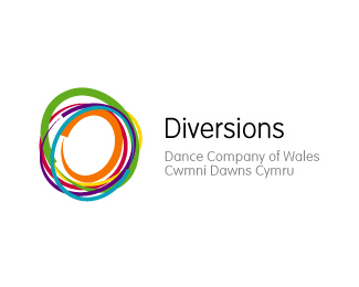
Identity concept for Diversions, the dance company of Wales. Aim of the mark was to attract a younger audience, whilst retaining their core followers.
Status:
Nothing set
Viewed:
4028
Share:



Lets Discuss
To me it has no relation to the name of the company.
Replyi get lots of movement from the mark...i.e. dance i guess....*Nice clear font*i think it works *good work
ReplyI get the dance like idea, a group of performers in different colored outfits twirling around creating a colored blur...**The 'Opera Australia' logo is done much the same way, but 'Diversions' is allot cleaner.
ReplyIt's colorful, but a bit too sloppy, and looks too similar to the Lucent Logo.**You need to better communicate the idea of %22Dance%22. Think of all words that relate to dance, as a start. You'll be surprised how many logo ideas this will inspire.**Good luck.
ReplyPlease login/signup to make a comment, registration is easy