Description:
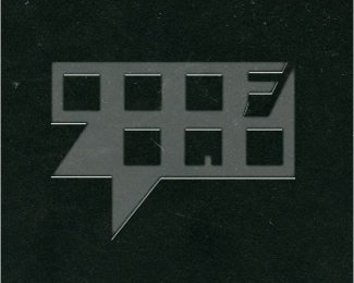
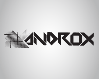
Today’s logo is for one of my favorite things ever, Sketchbooks, where great ideas are developed and the freedom of expression is emphasized. This logo is very geometric, using basic form and the negative space to spell out the company name also we tried to have this look as if it were pressed into the book.
Status:
Client work
Viewed:
1165
Share:


Lets Discuss
UFO!!
ReplyLet's just stop at day 9 and you use the other 66 days to read design tutorials.
ReplyThanks for Viewing and commenting.**but, Ok I'll bite.**Technically speaking, not conceptually, What is wrong with it? the colors, the implication, the presentation, the word. Does it need to be cute to be good? Should I upload 5 different versions for the masters to choose the best and destroy the others? Have a very nice day.
ReplyLogo need to be esthetic, recognizable, strong mark etc. Form is not clever it is a lot of objects and this is more like clouds. It is looking like scaned ruller. Colors are also problematic how it look in invert in white bg?
ReplyOk sorry about the delivery its actually placed on the back of my scanned sketchbook so i tried to get the texture but with logopond's 325x260 its kinda hard to see.
ReplyPlease login/signup to make a comment, registration is easy