Description:
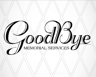
Day 4 of 75 Today we made a logo for a company that give you that one last chance to say goodbye to your loved ones. so the mark is a clean, smooth respectful piece.
Status:
Client work
Viewed:
1142
Share:

Lets Discuss
I'm speechless.
ReplyThanks, I know what you really intended but amongst all the negativity,but I'll take it.
ReplyFont is playfull cherfull and this is not for death people remeber. Try some leaf and old grave typo!! You need also thinking in association when making logo. Form, colours and style are important what logo is saying.
ReplyYa, this is too cheery. Need it to be more professional, but I understand why you would think this font would work. I probably would have tried it myself at first, but it is really not good. That background is better than the logo.
ReplyPlease login/signup to make a comment, registration is easy