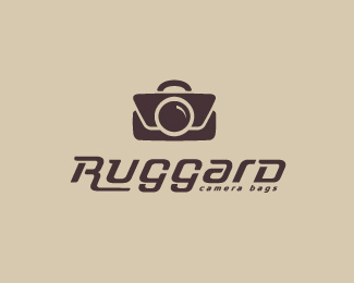
Ruggard
by Bitencourt • Uploaded: Sep. 16 '10

Float
(Floaters:
19 )
Description:
Typography study for a camera bags brand, inspired by 'american style', i'm looking for critiques, please :) - i'm loving work with type :P
As seen on:
Ruggard
Status:
Work in progress
Viewed:
2352
Share:


Lets Discuss
Wow, hot stuff man.
ReplyThanks JP :)
ReplyYes..very nice.
Replyreal nice. very clean.
ReplyThanks Matheus and Mike! really appreciated :)
ReplyLooks good, Breno! Like the overall look and love the 'g'. Only thing I'd say is that the bowl of the 'a' seems a little too close to the terminal. I think it makes it look a little squished. *Great work!
ReplyThanks a lot Clair, i will fix this issue :)
ReplyLooks very elegant. Like this, Breno!
ReplyThanks Davi,**Updated! looking for critiques please :)
Reply...and now love this type mate! :)
ReplyI got to say that I liked it how it was before.
ReplyThanks, Lane and Frank, the client rejected this proposal, anyway :/
ReplyI'm with Lane and Frank here, Breno.
ReplyPlease login/signup to make a comment, registration is easy