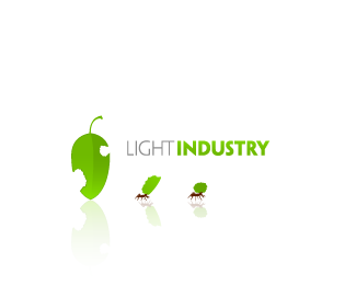
Description:
Yet another idea for Light Industry. I don\'t think I\'m done with this one yet, but I\'d like feedback.
Status:
Nothing set
Viewed:
10286
Share:

Lets Discuss
i really like it... just the way it is right now!
ReplyI bagged this one in my favs a while ago... it makes me smile.
Replyhrmmm. my only question is are the pieces of leaf really 'light' to the ants? as they look like they're having a hard time with the pieces. Maybe I'm off, but I'm just not getting a solid enough connection between the client name and the symbols...
ReplyI really like the concept and the %22industry%22-font is really great - but maybe its just a bit too bold, compared to the light one... Nice work!
ReplyOverall...love it! I agree with nead and think that one ant and leaf would simplify this and perhaps help with the movement issue Spiffy J mentions. The thing I'd like to call out is the symbol to text ratio. The text is too small compared to the leaf/ant GFX. If you were to scale this down you'd loose the legibility of %22light%22.
ReplyPlease login/signup to make a comment, registration is easy