
Description:
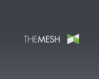
First concept for the rebrand of themesh.ca. The chess pawn element is a requirement. Constructive crits always appreciated.
Status:
Nothing set
Viewed:
2525
Share:



Lets Discuss
I like it. I think the blue pawn could be a little stronger. Now, I only see the light green one and what seems like a ghost on top of it.
ReplyLoving those colors. Very nice, Bernard!
ReplyThanks for the feedback guys. What about the typo? I'm not 100%25 stoked on it.**Also, the client has agreed to some concepts sans-pawn. More to come.
ReplyI think the type is fine. The only thing I see is that people may read it %22them%22 %22esh%22. Maybe a weight change. I think this face goes with the illustration style of the pawn(s). %22.ca%22 could be a bit larger. I can't see it reproducing well in smaller applications.
ReplyIm a sucker for overlays...but this one just seems to be missing something. I agree that .ca needs to be larger or it will get lost.
ReplyPlease login/signup to make a comment, registration is easy