Float
(Floaters:
0 )
Description:
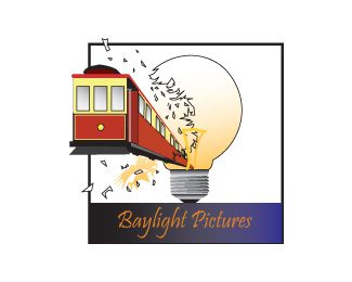
Made this for a friend, ended up not liking it, looking for opinions for changes
Status:
Unused proposal
Viewed:
627
Share:



Lets Discuss
Forget the lightbulb. You could do some great transparency effects with a beam of light from the streetcar itself.
ReplyI'm failing to make the connection between the name and the mark - perhaps a lighthouse would be a more appropriate image for that name? I would also recommend that for a logo you go with a more simplistic, iconic image that can be reproduced with only two colors (black and an accent or white and an accent). A great example in the genre of logos you're working in with this one would be Dreamworks - all done in ONE color.
Reply%5E Maybe Baylight has something to do with SF? Which I'm guessing is why there is a streetcar/trolleybus rather than a lighthouse?
Replythanks for the comments as for the name the person who wanted this done was looking for something that had to do with the bay area (SF) and a light bulb.
ReplyPlease login/signup to make a comment, registration is easy