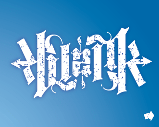
all city
by AusScreen • Uploaded: Mar. 03 '08 - Gallerized: Mar. '08

Float
(Floaters:
29 )
Description:
ambigram for t-shirt print
Status:
Nothing set
Viewed:
5333
Share:


Lets Discuss
very cool concept!
ReplyLove it. Read it easily which is always challenging with an ambigram.
ReplyGreat style but very hard to read.
ReplyI actually read it right away before I knew it was an ambigram, and with this many letters to work with, impressive.
ReplyI read it immediately as well - and then took a good look at how well this design was cleverly executed.
ReplyWow!! You really pulled this one off. Very impressive.
ReplyI came back again for another look. Brilliant and for a long ambigram, legibility is awesome.
Replythanks for the feedback, fellas,%0D*%0D*I am humbled%0D*%0D*-Aus
ReplyHard to read...
ReplyHave a look at some of Langdon's ambigrams. http://www.johnlangdon.net They aren't 100%25 legible upon first glance, but once you figure it out, it's clear every time. That's the important part. And he's one of the best!! :-)
ReplyDefinitely impressive...
ReplyI found it quite hard to read also.
Replyglorious effort - it's great to look at
Replyvery nice! read it the first time around.
Replythis is up there with Langdon's stuff in my opinion... though its not hard to imagine i would still like to see it in black.. on white. Well done.
Replya bad ambigram is an eyesore. A good one is a pleasant surprise. This is a good one.
ReplyEveryone is cheering because of the execution but logo design is more than applied style. I see no real reason for using an ambigram technique when its on the t-shirt medium... unless your target market has mirrors on the ceiling.
Replyi dont know.. if you were wearing the t-shirt %26 looked down at it yourself it would still read right.. %3B)
Replydache, why are you so ANTI ambigram? they're hard to do. Show's creative thinking and this one is very impressive.
Reply@ dache: following that logic there's really no need for design in logos at all. Why not just have a name represented in highly legible type? Anything beyond that is just applied style and ultimately subjective.**Or is design important as it goes to making the name stand out as memorable to its viewers?
ReplyThis is great!! :)
ReplyThis is really amazing.... Awesome execution.
ReplyLooks cool, but I can't read it. I can read the City part but %22All%22 is pretty difficult to see.
ReplyIt's hard for me to read as well%3B it took me a while. It might be that the symmetrical texture is interfering with its legibility - you may not need the grungy texture since the logo already has a lot of implicit texture.*Also, you could tweak the i's dot so it looks more like the bottom part of the %22l%22. Since City is pretty recognizable, I think 'All' needs a little more work.
Replywell done. City is easy All not so much but still readable.*Well done. Love the style. (oh, i see I already said Well Done - oops)***
ReplyI'm not english language man and without title %22all city%22 I can't read it at all.
ReplyI couldn't read it. I mostly had problems with the 'a'.
ReplyI read it right away from the thumbnail. *I studied under John Langdon and he would like this. **I don't think it needs all the styling though, it looks like it could stand on its own.
ReplyVery well executed. Although a little hard to read at first glance it still retains a pattern like impression which is creates a great impact!
ReplyCool!
ReplyPlease login/signup to make a comment, registration is easy