Float
(Floaters:
2 )
Description:
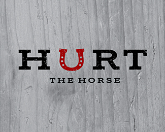
Logo for a family ranch. Hurt is a name of a horse.
Status:
Nothing set
Viewed:
1144
Share:

Lets Discuss
Looks great, good combination between the typeface and the horseshoe, to me I think it would make more of an impact if it was a name for a ranch to lose %22the horse%22 part. To me the horseshoe already implies something to do with horses and its kind of repeating itself. I know its named after a specific horse but I do not think it needs to be restated. I would consider using the word %22ranch%22 but I think that is kind of overdone and maybe just the one mark will make enough impact on its own, set a different standard, I guess you could say by not having the word ranch in their either, if you wanted to go out on a limb anyway. Btw, what typeface is that? does look very nice and all looks good together.
ReplyPlease login/signup to make a comment, registration is easy