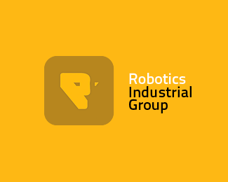
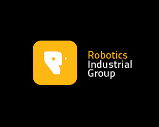
Robotics Industrial Group.
by Artgeko • Uploaded: Sep. 03 '12 - Gallerized: Sep. '12

Float
(Floaters:
37 )
Description:
Logo on a yellow background.
The company "Robotics Industrial Group" is engaged in the sale, installation and debugging of robotic technology for the largest enterprises.
Status:
Work in progress
Viewed:
12355
Tags:
Artgeko
•
Technology
•
Industrial
•
Robotics
Share:
Lets Discuss
I like the colorcombination, but the mark looks like a lion and that doesn't fit with the name
ReplyI floated this because I really like the technical execution, but I do have to agree with rdv about the mark looking like a big cat. He thought it looked lion-like; I actually thought 'panther' when I first saw it.
ReplyI get that the white portion is supposed to double as both the profile of a face (a robot face?) as well as an R, but the shapes of the eyes and the nose really give this a feline appearance.
Now, if you're referencing Ravage from The Transformers, then I can see the connection, but I seriously doubt a legitimate robotics company would want to associate with a toy line.
As much as I like the shapes of the eyes, perhaps you could try eyes that are either circular, ovoid, or half-moon shaped would not only diminish the feline appearance, but might also make the face look less sinister - which is how it currently looks.
Keep going with this one. I feel like you're close, but it needs some more work.
Thanks to all who voted and approved the work done, as well as for extensive comments with a piece of advice - there is a lot to think about and move on to improve!
Replydigs...but the mark instantly gives a panther face IMO
ReplyI thought the wild cat reference in the mark was intentional! Anyway, still dig it.
ReplyI agree, I will work on the development of ideas. Thank you for Your votes, opinions and advice.
Replythis is nice!
ReplyThank you, that estimated the idea!
ReplyYeah I instantly saw a big cat...cheetah...and loved it. Then realized it\'s not supposed to be a cat.
ReplyAlready working on this metamorphosis :)
Replymy advice is that it looks too much like the rockstar games logo. That was the first thing I saw
ReplyThanks for the comment, I appreciate, but in this case, the essence of the very idea with the possibility of its development, and not in a square plate with the letter \"R\" :)
Replygood job!
ReplyThank You Binoy!
ReplyI agree with most of the comments over here.
ReplyOne thing I\'d like to draw the attention is that this logo is going have some serious troubles at reduction. The little white point will desappear at smaller versions.
Great logo
ReplyPlease login/signup to make a comment, registration is easy