Description:
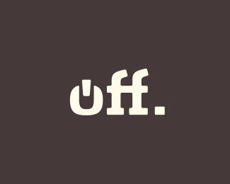
Logo for "off", a buttermilk with real vanilla.
As seen on:
dribbble
Status:
Student work
Viewed:
4927
Share:


Lets Discuss
I love what you have done with the 'f's.. but kinda feel the 'o' lets it down and is a little forced... almost like you were not willing to risk having the 'o' in the same vein/style as the 'f's.. shame really cause I think it would have looked better if it just read as %22off%22 without the gimmick...**just my opinion though...
Replycmon man, it's just an opinion. Nobody here is trying to bring down anyone else, it's just constructive criticism, which can be listened to or not. If you don't like someone else's opinion, that's fine, but there's no need to get smart with them.**In regards to the mark, i absolutely love the overall feel, especially seeing it on the bottle. I sadly don't understand the gimmick. Is it referencing the power on/off icon? Or is there some crazy cow/vanilla thing i'm missing? **Now ignoring all that stuff before my brain fries, i see some room for technical fine-tuning. spacing between certain things could be more unified, such as the area around the notch in the o (kinda tight comparatively). Refining of angles inside the 'o'. I like it overall, though! Well on it's way!
ReplySo I'm the only one who's convinced the %22O%22 is supposed to be understood as a (ring through) a cow's nose? %0D*
Replynido, thanks for the love. However I respectfully disagree about the %22o%22. *nathan, thank you for your comment and thoughts about the execution. Yes, it is supposed to be a stylized power symbol.*barry,had a good laugh reading your interpretation. Nice one but that was not intended :)
ReplyI think the slabs on the two F's could be / should be the same, apart from that i thinks its very nice, nathan makes some good points on the fine tuning.
ReplyOK, my impression was that it might not be the %22power off%22 you had in mind but off as in offbeat / off-broadway. (So, no scriptfont or white/blue/bright colors for kids, but something more for adults. And, yes a pierced cow instead.)
ReplyThe feet on the ff was the first thing i noticed, too, but after studying it for a while, i think it looks correct. The right foot on the second f should be larger, as it is balancing the ascender, so that it doesn't look like it's about to fall over. It should be perfectly lined up with the right side of the horizontal crossing line. I think it already is, it's just hard to be positive here. I swear last night i kept telling myself there was some milk jug representation in the negative space between the two f's! The only thing i would work on is that o. In the power symbol, the notch is perpendicular to the ends of the o (hard to explain in words). Here it is parallel to them, making it look like a u with something being inserted in to it. *Again props on the work, it is really smooth, and i truly mean that.
ReplyGreat work Julian, love it!
ReplyPlease login/signup to make a comment, registration is easy