Float
(Floaters:
11 )
Description:
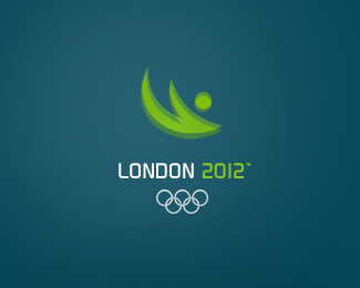
My version of the Olympic Games 2012 logo.
Status:
Nothing set
Viewed:
8506
Share:


Lets Discuss
Very nice. I love the movement it conveys.
ReplyType is cool. I get a sort of swimming feel from the mark.
Replya million times better than london's actual mark, wonderfully rhythmic %26 works best in green.
ReplyFor sure better than the chosen one ...
Reply@ Ocular: Thanks a lot.*@dache: Thank you, too. Is it a good or a bad swimming feel? : )*@Hayes and spasquini: Thanks for your comments. I also think the green version is better.
ReplyIf its a pictogram for the swimming events, in blue like the other version, yeah its a good feel. It seems to focused on that event and could benefit from a more global view of the games.
ReplyBeautiful logo. Well done.
ReplySorry Art Machine. I certainly don't like the new one - but I think this one suffers from much the same problem.. Sure it is certainly prettier that the real one but what does it communicate?
ReplyArt Machine: Can you tell us the font Name ?
ReplyOf course, the font is %22Continuum%22.
ReplyThanks %3B)
Replyyes - its work fine!!!!
ReplyDanke, Gelbdesign!
ReplyI like this a lot. Your very talented. To me it conveys movement of a swimmer. The font feels futuristic. Also, the deep green color feels like a rainy London day, which is a good thing. Very nice.
ReplyPlease login/signup to make a comment, registration is easy