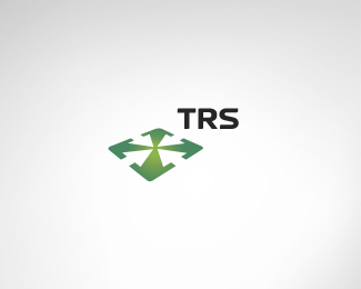
Description:
This is a logo concept for an events merchandise sales company.
I want to know whether you have already seen the mark I created anywhere.
It seems so simple someone must have done it already.
Comments please.
Status:
Nothing set
Viewed:
4736
Share:

Lets Discuss
I think its a cool symbol. Maybe you can add some perspective to it though, like having the upper arrow going a tad further into the distance as for the moment I feel it leaning forward, top heavy from the bottom arrow head - which gives a bit of a negative connotation. It would be better, for me, if it had a harder gradient, like two colors - say arrow head and arrow %22body%22. The gradient doesnt seem optically centered, cant say. Again this is just what I think about this symbol and how you can improve on it.
ReplyHey Dache,**your comment is always welcome! *Concerning your suggestions...distorting it to make it more unique is something I also thought about, but that ruins the shapes of the arrows going inside (the negative space). *As for alternative gradients I'll try some. : )*
ReplyHey A M,%0D*nice logo. nice and clean... %E0 la WII. What font is that bro?%0D*cheers,%0D*M
ReplyThank you marc, the font is %22SKYfontThick%22
Replyloving the mark ... class
ReplyPlease login/signup to make a comment, registration is easy