Description:
FRIESH "Fresh Fish"
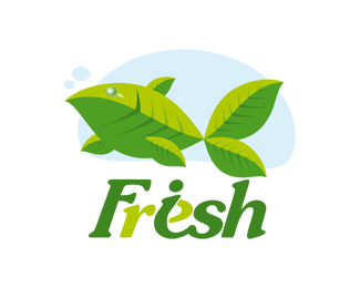
A fish created by the leaves, looks like a plant.
The leaves are a symbol of ecology.
Logo suitable for fish shops, fish farmers, fish manure, or simple blogs for discussing food.
As seen on:
http://stocklogos.com/logo/freshfish-friesh
Status:
Work in progress
Viewed:
7317
Share:


Lets Discuss
great concept ... like it !!
ReplyThank you very much.....
ReplyI don%60t know.. smells more like a stock than a fresh to me..
ReplyI do not really like the lettering.*I need to change!!
ReplyStock logos...... Nah, I will just take a walk now, even though it's freezing outside, like 5 below. It will feel much nicer.....
ReplyMy main issue with this is that all of the fins look like 'copy paste'. Also, the text doesn't work.
Reply'copy paste'. - Yes*text doesn't work - Agree
ReplyAlso i dont think you are allowed to link to that kind of site, just an FYI %3B)
Replybecause it is not allowed?*in the %22Upload logos%22 %3D%3E Seen on 'website name' (optional)
ReplyYou're not supposed to link to stock logo websites. That was a rule they made a long time ago.
ReplyPlease show me where I can read these rules. Thanks
ReplySo fresh. I like it.
ReplyThanks Loombago
ReplyI like the concept a lot.
ReplyEver considered instead of using two tones of Green, changing the light Green to a light blue?
Not sure what to do about the lettering though.
Please login/signup to make a comment, registration is easy