Alpha and Omega, v1
by Anton42 • Uploaded: Jul. 20 '09

Float
(Floaters:
0 )
Description:
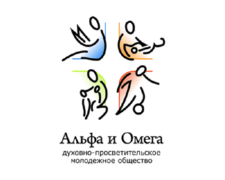
The idea of this logo is that the letters "alpha" and "omega" represent us, and we can only cast shadow - while the light of God creates the cross around that shadow.
As seen on:
Alpha and Omega, Christian Youth Society
Status:
Unused proposal
Viewed:
774
Share:


Lets Discuss
It gives an impression that the letters will now slide to the left. Font of alpha and omega seems very different. The letters seem to be illuminated from left-top, but shadow is drawn as if illumination is from forward-left. Illogical asymmetry of cross on shadow makes whole picture even more twisted and surrealistic.
ReplyPlease login/signup to make a comment, registration is easy