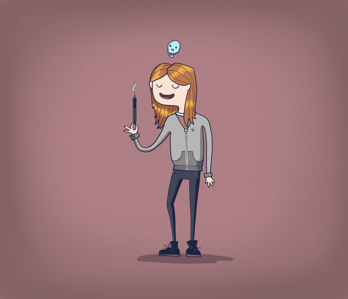
I like your original aproach and the mark is funny :)*But positioning of elements looks confuzing a bit. I would remove %22The%22 and maybe lift up the scull. Good luck!
i love the whimsical nature it has but i agree that the center of the text matching with the hair on the skull is a bit odd. maybe you can do something to have the skill hit the middle of the text without the bones being too akward looking. i also think the %22The%22 above the hair is a bit out of sync with the rest of the composition, perhaps the squiggle of hair can actually turn into the word %22The%22 just a thought. regardless its almost there, great work.


Lets Discuss
I like your original aproach and the mark is funny :)*But positioning of elements looks confuzing a bit. I would remove %22The%22 and maybe lift up the scull. Good luck!
Replyi love the whimsical nature it has but i agree that the center of the text matching with the hair on the skull is a bit odd. maybe you can do something to have the skill hit the middle of the text without the bones being too akward looking. i also think the %22The%22 above the hair is a bit out of sync with the rest of the composition, perhaps the squiggle of hair can actually turn into the word %22The%22 just a thought. regardless its almost there, great work.
ReplyThank you very much, will use your advice)
ReplyPlease login/signup to make a comment, registration is easy