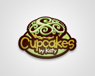
Cupcake Logo 1
by AndyStone • Uploaded: Jan. 04 '11

Float
(Floaters:
5 )
Description:
Cupcake Logo There are 3. The client picked the one I liked the least.
As seen on:
AndyStone.org
Status:
Unused proposal
Viewed:
7423
Share:

Lets Discuss
Hmmm...your use of the highlight doesn't ad anything to your logos. They are great designs. Let them show without desaturating those areas.
ReplyI disagree. You can always give them a solid color version for embroidery. I like the highlighting and shadowing effects you've used. **I wouldn't have done the speckles, though. **A client not picking the one the designer likes?!? That never happens!
ReplyPlease login/signup to make a comment, registration is easy