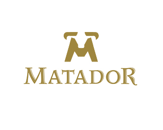
Description:
Done just for fun in 2014. Work in progress
Status:
Just for fun
Viewed:
4160
Tags:
powerful
•
elegance
•
elegant
•
bull
Share:


Lets Discuss
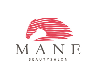
Good one! The type is too girly, imo.
ReplyGreat, but I agree with Nikita.
Reply@ ru–ferret, @ cleber: thank you guys! I appreciate your comments. I am going to look for a type that is stronger and more masculine. At the same time I want to keep it elegant and expensive. Since its not client work I am not sure if I will spend the time to customize.
ReplyI definitely wouldn't call that typeface girly. It feels masculine to me. It is, however, slightly mismatched with the mark.
ReplyGreat work... I agree with Nikita...
Replysamdemastrie, fraGile, thank you for your comment. I am working on a custom type that should match better. hopefully.
Replygreat mark
ReplyThank you jayp!
ReplyPlease login/signup to make a comment, registration is easy