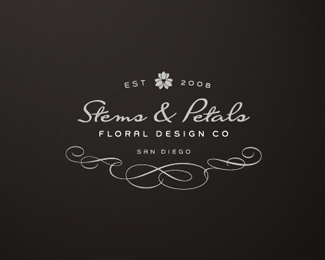
Float
(Floaters:
34 )
Description:
Work in Progress for a dear friend.
Status:
Nothing set
Viewed:
5900
Share:





Lets Discuss
I think the lines on the bottom are a little unnecessary, and if they are going to be there I'd make them symmetrical. I like the type arrangement.
ReplyVery classy! :)
Reply%5Eagreed with saawan, and I actually like the asymetrical aspect of the flourishes myself.
ReplyThanks guys! I just posted a %22NEW VERSION%22:http://logopond.com/gallery/detail/49101 check it out and let me know which you like best.
ReplyNice! Really charming.
ReplyThanks Julian.
ReplyThis is gorgeous %26 I prefer it to your second version. I agree with gyui %26 love the asymmetry of the flourishes. Your entire portfolio is beautiful :)
ReplyAwesome! Is that a font used for Stems %26 Petals?*How about using ESTD or EST. (period) to make the top more symmetrical?
ReplyPlease login/signup to make a comment, registration is easy