
Float
(Floaters:
1 )
Description:
Personal project for faux cosmetic co.
Status:
Nothing set
Viewed:
2950
Share:



Lets Discuss
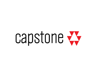
The type is a bit hard to read, especially cosmetics. Other than that, it's really good.
ReplyAll i see is the http://www.target.com brand. Sorry.
ReplyI can understand why you see target since they have spent %22bazillions%22 on marketing their brand. The mark is supposed to be an abstract representation of rain drops falling in a puddle.
ReplyI can see the rain drops, I understand it, being red %26 white also lends to the links to Target.**I like it, but I agree with Jayred, I found the type is difficult to read without squinting.
ReplyFinal color is actually orange (monitors lie :P ), but obviously needs to be a completely different color to not be associated with Target™. As far as the tagline, yeah definitely needs to be larger. Not going to re-visit this as it is over 5yrs old now.
ReplyPlease login/signup to make a comment, registration is easy