Float
(Floaters:
2 )
Description:
Kansas City
Coffee and wine bar
Status:
Client work
Viewed:
1469
Share:

Lets Discuss
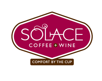
Overall it's nice. The SOLACE typography is beautiful. My only gripe is %22COMFORT BY THE CUP%22 on the bottom - it really looks and feels like an afterthought. I would take another look at integrating it better.
ReplyThanks for the input. If we had it our way, it would have been left at the %22Solace%22 type treatment, but alas, clients have their opinions.
ReplyPlease login/signup to make a comment, registration is easy