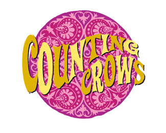
Counting Crows
by AlphabetArmDesign • Uploaded: Jun. 02 '08

Float
(Floaters:
0 )
Description:
California
Rock / Pop band
Status:
Client work
Viewed:
2716
Share:


Lets Discuss
I like the sign, don't like the cartoon. Seems like both are from different sources.
ReplyI think a telephone line with crows along it would look better than the cartoon and done with the same aged look as you have the black.
Reply@THEArtistT - Cool idea, we've seen that treatment used before. We like to come up with new strategies to reflect the client's needs.
ReplyPlease login/signup to make a comment, registration is easy