Description:
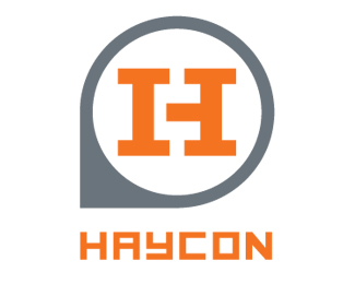
The focus of HAYCON is design oriented construction. The principal has a deep understanding of architecture and an appreciation for design nuances. Our goal was to develop an identity that would appeal to smaller specialized clients as well as large construction companies. The mark itself references the rigid geometry and tectonics of construction, while retaining a sensibility that suggests high design. The i-beams that form the strokes of the H create a negative space that contains a hidden C (representing the CONstruction in HAYCON). The circular/pointer shape is influenced by an elevation mark found on architectural drawings (with a stylistic twist, of course). Our intent was to create a bold mark that is eye-catching and quickly legible from afar, but could reveal additional levels of detail over time.
As seen on:
Haycon
Status:
Client work
Viewed:
1950
Share:

Lets Discuss
Please login/signup to make a comment, registration is easy