Description:
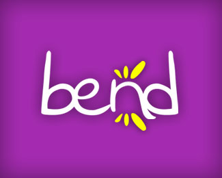
Logo made for a Pop band from Barranquilla, Colombia. I'm looking forward to have a feedback in this one, bring it on! Specially the colors. ;)
As seen on:
Bend MySpace
Status:
Nothing set
Viewed:
1777
Share:

Lets Discuss
I like the colors you have here. I think the type is appropriate for the assumed age group and a for a pop band. Somehow, the space between the %22e%22 and the %22n%22 is a little much though, since the other letters are so tightly kerned. you might consider tightening that up, but doing so without letting the %22e%22 crossover the %22n%22. Also, It might be hard to always have the logo reversed out of another color. Is there a version of this that is not reversed out of a darker color? Good luck and beautiful solution.
ReplyPlease login/signup to make a comment, registration is easy