Float
(Floaters:
12 )
Description:
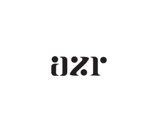
Typework made from scratch. UPDATED!
Status:
Nothing set
Viewed:
3361
Share:


Lets Discuss
Playing around with some type work, how does it read?*And what's your opinion on the Z. Personally i think it leans a bit too much to the left?
ReplyLooks good. I read %22azr%22 instantly:)*As for the %22z%22, yes, because of the upper part the whole letter is pulled more to left.
ReplyLooks great. The 'z' looks inbalanced because of what Rokac said.
ReplyThank you guys, i'll try working some more on the z.
Replyagre, balance the z, this turns into a nice typeface.
ReplyUpdated the z, and worked a bit on the spacing.
ReplyBalanced, but the %22stroke%22 on %22z%22 doesn't match the %22steams%22 on %22a%22/%22r%22.
ReplyI somehow agree, looks a bit too curvy too, now that i come to think about it. Guess i have to boot illustrator up once again.
ReplyWhat Roka said. Other than that, good stuff.
ReplyGreat subtraction. Very interesting and readable
ReplyPlease login/signup to make a comment, registration is easy