Description:
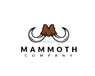
Logo concept for "Mammoth"
Status:
Unused proposal
Viewed:
9232
Tags:
fur
•
mammoth
•
tusk
Share:



Lets Discuss
http://www.coloradomammoth.com
ReplyIt is not a plagiarism. There are billions logos in the world and of course there are thousands same ideas.
ReplyThere is a nice example of plagiarism here:
http://theisens.cachefly.net/brandimages/BearArchery.jpg
and
http://barsukovo.ru/
@LoGoBoom
ReplyI didn't knew about the logo from the http://www.coloradomammoth.com.
I think that is not a copy. The style is really different and the idea its there by combining the M from mammoth with a symbol of a mammoth (the tusk).
@Savik
ReplyThank you for support!
I didn't think it was plagiarism. It just reminded me of this logo as I see it all the time in CO. And it's executed really, really well.
ReplyCool :)
ReplyExecuted pretty differently. clapp
ReplyPlease login/signup to make a comment, registration is easy