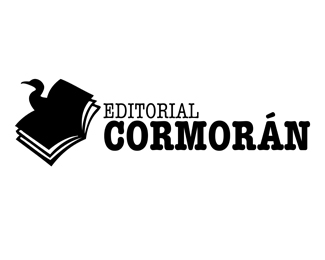
I like the mark but I think the type does not work with it. To over powering. As for the mark I think you could make the book look more like a open book and not have the body of the Cormoran drop out the bottom and also tighten up the edges where the pages meet the cover. Does this make sense?


Lets Discuss
I like the mark but I think the type does not work with it. To over powering. As for the mark I think you could make the book look more like a open book and not have the body of the Cormoran drop out the bottom and also tighten up the edges where the pages meet the cover. Does this make sense?
ReplyPlease login/signup to make a comment, registration is easy