Description:
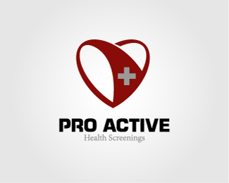
For a health screening company...Vascular and circulatory screening. Feedback. UPDATED from feedback.
Status:
Client work
Viewed:
19689
Share:


Lets Discuss
I like everything except the red line at the bottom. It's distracting. I'd remove that and then center the tagline and increaste the type size a bit.
ReplyI really like this mark over the other one. I can easily see it on a nurses uniform or polo. The space btw PRO and ACTIVE feels a lil big to me though.
ReplyI fully agree with Darrel. Lose the red bar %26 center the tagline.**I'd possibly also try the non-itallic tagline, and the lower case as well to see what balances better.
ReplyGreat suggestions all...I will play with it.**THANKS
ReplyUpdated...what do you think?*Good suggestions I think.
Replythe revisions look great. Not sure how critical the tagline is. If it's really important, maybe darken the gray or increase the font size a tad more.**don't letterspace the tagline, though...that rarely works.
ReplySure about the colors? The white on red cross is associated with Switzerland, health care is associated with a red cross on white background.
ReplyExcellent, even if I have to agree with dache previous comment... It has been my first tought about your work, it make me thinking about Switzerland... Even if I don't like this %22impact-like%22 font, I think the last %22E%22 needs a little more work on the upper and downer horizontal stems, they look a bit large.
ReplyHey, I love this mark. Cool take on a heart and all... and I didn't think Switzerland right away. But I agree with some of the other comments on the type... not my favorite.
ReplyAwesome guys. I really like all the valid feedback. I will play with some ideas and try to modify.**Hackar: I don't think the spacing would really add anything.**Darrel: It's actually part of the name. I just made it secondary because I didn't think it was that imortant. It's more what they do then who they are. I intentionaly subdued it. I will play with bringing it out a bit more though.**Dache: I see your poitn with the color. That is still up in the air. The client like red...but I wanted to use a richer color. I will try playing with the cross color to help detract from the swiss resemblance. **As usual thanks for the feedback...you are all true pros.
ReplyOh yeah, as far as the type goes. The client really wanted a thick bold font. So I tried to use one with a bit of techy character...something with some curves. I did use a serif font that works as well...I will continue to play with that too.
Replywhite cross on red does %3D swiss.**HOWEVER red cross on white in the context of the medical field is a registered trademark of Johnson and Johnson, with the American Red Cross having an agreement with J%26J to 'borrow' it. So be very careful making any medical logo using the red cross in it.
ReplyGreat info! Thanks for the research. I will play with some other colors and that should solve that.
ReplyNice mark. After reading the name, however, I would try to alter the heart shape so the %22tick%22 mark would be clearly visible, maybe?%0D*%0D*You could also find nicer typeface.
ReplyTick mark?
ReplyGreat job creating a nice logo with two very recognizable shapes. I'm impressed.
ReplyThanks Kevin! Very appreciated coming from you.
ReplyAhab... I wanted to comment on this for a while. I think your concept is very strong. However I have to agree with the Swiss comments, but I do not think it should be much of a factor. So roll with it man. The type is a little to agressive in my opinion.
ReplyThanks Bart. Great input. Yeah, I agree about the type...but the client wanted (insisted on) something heavy and bold. I came up with some %22less agressive%22 type options though. I will have to update the image when I get there.**Your stuff rocks by the way.
Replygreat memorable icon. not so sure about the font, looking forward to the update.
ReplyHere it is with some minor updates. different font and I filled the cross with the same color as the %22Health screenings%22. I think this helps the swiss part of the look.
ReplyDoes anyone see women's underwear?
Replyperv.
ReplyHi ahab, nice logo that is really visual and brings across the message. I'd like to have this on my site and link back to yours, as I'm running a series of artwork based on heart shapes.**It will even be better if you can comment on the tools used and your inspiration. Do check out my site cluelessclay.com and let me know if you like to have a post on this design, cheers!
ReplyThanks Mei. Yeah, sure...just let me know.
ReplyHi, your logo will go live on a blog entry on 1 Dec and I have linked back to your website and also your showcase in logopond.com. Feel free to email me (email on my page at my site) if you like to put in further info or link backs. Thanks!
ReplyInteresting suggestions. I'll play with it. Thanks, Moxel.
ReplyNice logo. I think it catches all the important elements of life or a heart in general but I have to disagree with the color. It seems kind of pale... and I don't want to have a %22dying%22 heart in a logo... Ok so we can't have a shiny red but maybe something in between would really do the trick.*__________________________*%3Ca rel%3D%22follow%22 href%3D%22http://www.onlinelegalsteroids.com/%22%3Ebuy legal steroids%3C/a%3E
ReplyAfter all the comments I think the silver color for the cross is the most appropriate change you have made. Congrats to you on a beautiful logo!
Replyna, el imagotipo esta mal empleado da la sensacion de ropa interior femenina o de un club nocturno de baile exotico*
Replyna, the imagotype wrong employee gives the feeling of lingerie or an exotic dance nightclub
ReplyPlease login/signup to make a comment, registration is easy