
Float
(Floaters:
60 )
Description:
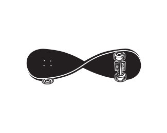
Here is the comp with all the comment input applied...great comments all.
Status:
Unused proposal
Viewed:
18027
Share:





Lets Discuss
This is a truly amazing mark. Great job.
ReplyThank you oaknd.
ReplyLovely!!!
Replyvery cool. imagine if the company name was O'Harris
Replyooohhh yeah, that would be cool.**Thanks guys.
Replywooww it's great!
ReplyCracking device. Nice one!
ReplyThanks guys
Replyall i can say is WOW!!%0D*the mark is fantastic! the idea is breath taking..%0D*%0D*very good job ahab!
ReplyThank you very much.
Replythats nice...love it. good job! great harmonious use of colour as well...:)
Replythank you.
ReplyVery Nice indeed. Love it.
ReplyThanks...
Replynice work
ReplyThanks!
Replythis is very very original. Fantastic.%0D*%0D*I saw your show case this is your best work
ReplyThanks icu! I think I would have to agree with you.
Replythe mark is genius
ReplyWOW! Thanks Raja.*I really appreciate that. Your stuff rocks btw,
ReplyThis mark is amazing!
ReplyThanks influxes! I appreciate it.
Replyfantastic!
ReplyThanks you!
Replygreat execution. good colors and love the usage of negative space. nice work.
ReplyThanks, MeTico!**You have a very vast and impressive collection yourself.
ReplySUPER!!!
Replyamazing work!!!
Replyi'm writing this just so ahab will thank me too! just kidding, nice work, ahab
ReplyHA HA HA!!! Nice, onesummer. I can't help it...I am very thankful. I appreciate all comments from this community.**LOGOPED: THANKS!*Oronoz:THANKS!*onesummer: an extra special THANKS A LOT for you!
Replyi remember when you first posted this.. back in nineteenticketytoo... loved it then.. love it now... dont want your babies though!
ReplyHA HA HA!!! Very nice! I was a bit firsed up this morning and feeling silly.**Thanks for the props.
ReplyClap Clap Clap!!....simply GREAT
ReplySomebody just blew me out of my socks ... %0D*Wow, well done, well executed! I've never seen a more beautiful 'H'
ReplyThanks, Sordoff. Very appreciated.
ReplyI hate you...in the best way possible.
ReplyLOL! Thanks!
ReplyThis is just fab, ahab! Sorry.
ReplyThanks. Sorry for what?
ReplyNicely Done! Applause on using the negative space
ReplyI think it would look a bit better without the gray stroke.
ReplyThanks guys.
ReplySuperb use of the negative space. But I suspect you already know that :)
Replyof course, it inspired the whole mark. :)**Thanks alot
ReplyVery strong, congrats!
ReplyThanks a lot!
ReplyVery nice! Well done! :)
ReplyPlease login/signup to make a comment, registration is easy