Reborn
by Agge • Uploaded: Jan. 11 '08

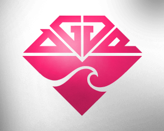
Float
(Floaters:
2 )
Description:
A logo for a fictitious company of mine. Tried to give it a (snow)boardish feeling.
Status:
Nothing set
Viewed:
3174
Share:

Lets Discuss
this is nice and the color scheme is great. the only concern I have is ...um... well the o-shape's tail makes it look like a sperm. Or maybe my mind should just get out of the gutter. :)
Replythank you heirophant. If you read what the logotype says, you'll notice that your mind may not have seen wrong. A sperm inside of another sperm, how can it be more reborn?
Replyhaha ... silly me. :) I see that now... duh. :P
ReplyHaha, that's pretty clever.
ReplyCan I ask what typeface you have used here??
ReplyPlease login/signup to make a comment, registration is easy