ActiveCollab
by ActiveCollab • Uploaded: Jan. 25 '19 - Gallerized: Jul. '19


Float
(Floaters:
24 )
Description:
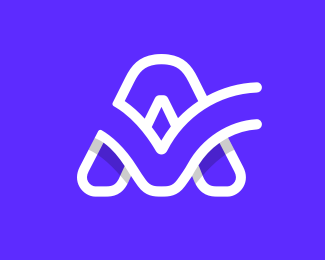
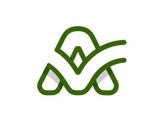
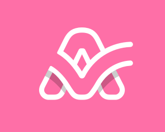
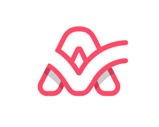
This was the first time we actually devoted time and effort to defining ActiveCollab as a brand. Creating a new logo was a part of the whole rebranding project. Since there were problems with the current logo - it had a generic form that lacked the ability to clearly communicate our branding - we decided to create one from scratch. We also wanted the confusion with the Finder logo to end.
The main goal was to create a recognizable form that clearly represents ActiveCollab. We also wanted it to go well with the trends, but also to be timeless. Through the form, we wanted to communicate activity, collaboration, and synergy. The primary use is, of course, in digital media, however, we wanted the form to work with other media as well. One of the priorities was also making it equally masculine and feminine.
The curved arch of the A represents the softer, streamlined approach with which the website and app were redesigned, while the checkmark epitomizes the ultimate satisfying affirmation of finishing a job - checking off a completed task in one playful, fluid gesture.
As seen on:
ActiveCollab
Status:
Client work
Viewed:
7896
Share:
Lets Discuss
Great! love it!!!!
Replyhttps://dribbble.com/shots/4753055-check-mark-a
ReplyPlease login/signup to make a comment, registration is easy