Description:
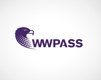
This logo for WWPass needed to show the watchful eye that the company has over it's clients, allowing them to confidently and securely engage in sensitive electronic transactions. It also needed to show that they are a safety net of protection for their clients.
Status:
Work in progress
Viewed:
2818
Share:



Lets Discuss
still want to see a version with the beak and eye silhouetted out, too, with the head pointing a little more upwards and the beak a little less blocky. As far as type, she needs some kern-love. I think there should be some sort of separation between the WW and Pass. Not necessarily space, just maybe a different weight or color. This is lookin good, though, sir. Hope everythin else is goin well.
ReplyPlease login/signup to make a comment, registration is easy