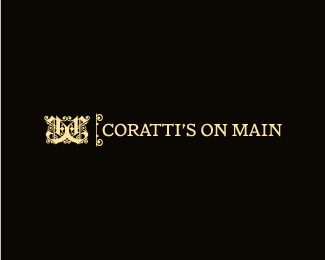
Coratti's on Main
by AMP • Uploaded: Mar. 23 '10

Float
(Floaters:
10 )
Description:
Logo proposal for an Italian restaurant.
Status:
Nothing set
Viewed:
2117
Share:


Lets Discuss
That is so beautiful, would that be a gold? love cream and black.
ReplyThank you! If they choose this option, i was thinking gold foil on thick black card stock for the business cards (very italian lol). But I really like black and cream as well. more subtle.
Replywell done! Best wishes %3B)
ReplyI like this. Nice work.
ReplyThanks, Ryan! I'm hoping they go with this version.
Replyvery elegant
Replythanks birofunk, and thanks for the floats :)
ReplyThis feels like tuxedo/centurion american card place now... Can you support that with the menu ? %3B)
Replyha! first of all, i had to google %22centurion american card%22. second of all, i was also wondering if this logo was too much for the restaurant - but i was assured by a number of regulars that it is not. the menu and atmosphere are classic italian, not inexpensive, but not black tie either. i was going more for a classic feel with the design. I think the restaurant can support this logo. It's a much nicer place than its current logo conveys. I want the identity to match the ambiance.
ReplyThen we can all just say: Ma che bella!
ReplyPlease login/signup to make a comment, registration is easy