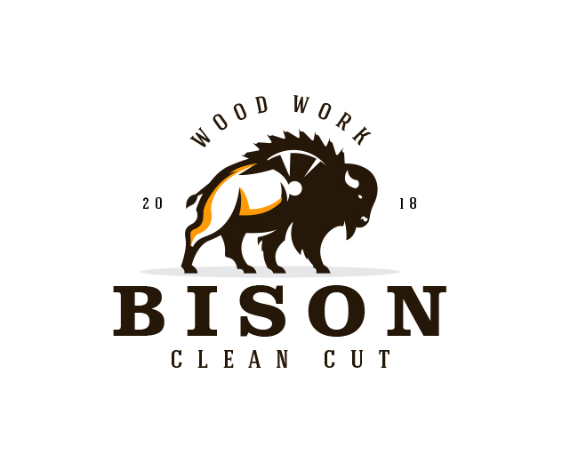
Bison Clean Cut
by AlexSeciu • Uploaded: Feb. 06 '18 - Gallerized: Feb. '18
Float
(Floaters:
50 )
Description:
Logo concept for Bison Clean Cut
Status:
Unused proposal
Viewed:
7,453
Tags:
•
chainsaw
•
wood
•
horns
Share:





Lets Discuss
Beautiful illustration, it took a second to see the saw though and the circular nature of the saw versus the uncentered woodwork is throwing me a bit. also, the space between the S and the O is larger than needed and the O and the N. the B and the I is ok... just basic typesetting. But overall it hits the mark and looks quite original. nice work.
ReplyThis is so cool!
Reply@ElephantMark Thank you for your appreciation and feedback. ;)
Reply@farazshkh Thank's ;)
Reply@nabillarumy Thank'sss ;)
ReplyPlease login/signup to make a comment, registration is easy