HUEMINCE
by 51X • Uploaded: Jun. 24 '10

Float
(Floaters:
8 )
Description:
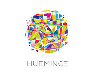
The mark consist of a sphere of many hues, minced into pieces. The name is also a play on the word "Humans"
Status:
Nothing set
Viewed:
3421
Share:

Lets Discuss
Comments, thoughts?
ReplyI really like the image.. I don't think the font matches though.
ReplyThank you for your quick feedback. May I ask- what type of tipography would you suggest?
Replywell i'm not sure what the answer is.. **maybe use just one to two colors for the type? maybe HUE one color and MINCE the other.. maybe just a nice neutraface or gotham.. just something less condensed.. **It may work even better to somehow fragment the type a little like your image.. this would prob be best custom-done..
ReplyLove it...I think the font is fine but maybe make it a dark gray or something....the icon is busy enough...keep the type clean. Nicely done!!
ReplyPlease login/signup to make a comment, registration is easy